5 Tips for Creating a Trustworthy Website That Converts New Clients

When was the last time your website helped you convert a customer all on its own? How long has it been since a high-quality lead came through one of your site’s contact forms?
If you’re not seeing this kind of action from your website, it’s probably missing a few key elements that help build trust in your customer’s eyes.
See, most agencies just use their website to focus on information about their company and use their space to showcase quality portfolio features. While this is a great place to start, it’s not exactly enough to convert potential customers—and it certainly won’t help you stand out from the pack.
Instead, you need to concentrate on adding trust-building elements that help reiterate why your company is the right (and least risky) choice for your potential customer. Let’s talk about how to do just that.
Tip #1: Focus on Your Client’s Needs
This may seem counterintuitive, but when it comes to your website, it’s not all about you or your company.
Yes, it’s going to have specific areas that speak about what your company does and stands for, but at the heart of it, it should be customer-focused.
Always ask yourself, What will my target customer look for when they land on my site?
This is what’s really important for them to see.
So once you’ve identified these key features and terms, you’ll want to rank them and place them prominently on your site. The most important features should be first; let everything else trickle down in order of importance.
As your prospect scrolls down your page, they’ll find exactly what they’re looking for right away, and ideally, they’ll find this information above the fold.
Action Step: Ditch the large scrolling image banner that takes up far too much “retail” space on your homepage. Opt for a wider, parallax-style layout that highlights each of your customer-focused benefits as the user scrolls to learn more.

Tip #2: Show Results & How You Achieved These With Your Client
Your customers should see your previous results first and foremost as they scroll. But, we’re not just referring to testimonials here.
Yes, testimonials are nice and they’re certainly a must-have, but if you really want to stand out, take it one step further to where many agencies fail to go.
In addition to testimonials, carve out a piece of space on your site for customer case studies and before and after results from working with your existing clients.
You’ll want to include a little teaser on the homepage that links to a separate write up about the original problem, which includes how your company tackled the issue, and share your end results.
This goes beyond simply creating an online portfolio—it helps you convert in two big ways:
First, this method gives your potential customer a glimpse into the quality of work your team produces. It also shows how you’ve helped another business overcome a similar obstacle your potential client may be in.
When your potential customer sees how you’ve helped customers in the past and not just the polished final product (i.e. traditional portfolios), they’ll see that you are definitely the right choice for them.
This helps reduce their feelings of risk since they have more than just your word or someone else’s testimonial to go off of.
Second, when your potential customer identifies and relates to a specific problem your previous customer also faced, they’ll have another solid reason to choose your services: You have the experience to get them through this.
Action Step: To show how you’ve helped companies in the past, create high-quality visuals and screenshots to support your work. Include these with the case studies you generate and publish. This will require more work from your team, but it is certainly worth the extra effort.
Tip #3: Use Visuals to Show Social Proof
Company logos are the perfect way to visually show off your reputation and authority.
By placing these on your homepage, you’ll show potential customers that other reputable companies chose your services and achieved success working with you in the past. This is just another way for your potential customer to reduce their risks of going with your agency.
It’s a smart idea to list both clients and partnerships that you’ve work with, since—chances are—someone will recognize one of your partners as a shared connection, which further builds trust.
Tip #4: Ditch the Stock Photos
Hopefully your agency has realized that stock photos aren’t going to get you anywhere. In case you haven’t heard yet, stock photos have to go.
Stock photos are so generic that the impression they give off is exactly that—bland, zero personality, and very little effort.
When your potential client has a plethora of options to choose from, they’re certainly not going to waste their time with a company that’s generic and boring. In the small chance that they do, they won’t want to pay top dollar for it.
When your agency opts to use stock photos, it lessens the quality of your work even when you have a killer portfolio. That’s how damaging they can be when it comes to building trust.
Instead, spend the extra money on hiring a professional photographer or using someone with experience in-house to take quality photos.
These photos aren’t just for professional headshots on the About or Team pages. Rather, you should use these photos throughout your website.
Real-life photos, such as a sneak peek into your office environment or even the surrounding area where your office resides, give your clients the impression that they know you on a personal level. You want them to feel as if they’re standing right in front of you even when they aren’t.
You can only give off this authentic impression when you ditch the stock photos and replace them with original, genuine ones.
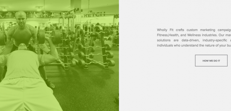
Here’s an example from a fitness-focused marketing agency in West Palm Beach, FL:

On their homepage, you’ll see a picture of the team running right outside of their office downtown.

And, in this one, the CMO and the COO are pumping iron together as they explain their process to the right. This gives readers a feel for what they do in their spare time in addition to their time spent marketing. For fitness-focused brands, this is exactly the type of company you’d want on your team.
Tip #5: Get Rid of the Fluff
In the same way that the generic photos have to go, so does the generic copy.
Phrases like “results-oriented” and “our goal is to exceed expectations” mean absolutely nothing. These are to be expected.
Get rid of the fluff and be more specific with your website content. Your content should showcase two things: your agency’s personality or style and the specific results you’ve achieved for clients in the past.
When potential customers get a feel for your agency, they’ll have a better understanding of your mission and how you’re really a good fit for them. Share your specific achievements and you’ll basically prove that you are in fact the right choice thanks to your experience. Take advantage of each of these five tips to create a trustworthy website that converts customers all on its own.
As long as you keep your target customer in mind and look at your website from their perspective the entire time, you’ll be in good shape.
It’s also a solid idea to craft superior case studies since your potential customers are going to want to see the results you’ve delivered in the past. This key area lessens the risks potential customers may have for choosing you, which means they’ll be more likely to convert.
Once they see how awesome your work was with prestigious companies in their same predicament, they won’t think twice about contacting your agency for help.
