6 Ways to Make Your Design Portfolio Generate Leads

Designers take great pride in their portfolios. It becomes a point of pride to regularly update, redesign and generally fiddle around with them. After all, a portfolio is the gateway to your brand. It’s your 24 hour calling card.
So why do so few portfolios convert visitors into leads?
As designers we sweat the details. We worry about the small things. Heaven knows we’re capable of spending days, weeks and even months worrying about the smallest of details. But one of the questions we rarely ask ourselves is, “Is my portfolio working hard enough?”.
What seems fundamental to any portfolio is too often left on the sidelines. Some portfolio mistakes are easy to correct, they’re no brainers. Others require a little more thought, and possibly another redesign :)
Let’s take a look at some of the areas where your portfolio could be letting you down.
Not having a clearly defined client

As the old saying goes; “Market to everyone and you market to no one”. The same is true for the value proposition that every visitor will see the second they hit your website.
Gone are the days of “Hey, I’m a web designer. Let’s talk!”. You need to let your visitor know they are indeed in right place.
Ask yourself a few simple questions:
- What do you do, specifically? (I design stuff for the web won’t cut it)
- What kind of person or group of people do you tend to work with most? (Or what kind of people would you like to work with?)
- Do you want to work with a particular type of client as opposed to just anyone who gets in touch?
The answers to these questions will help you to define who your ideal client type is, and therefore speak directly to them.
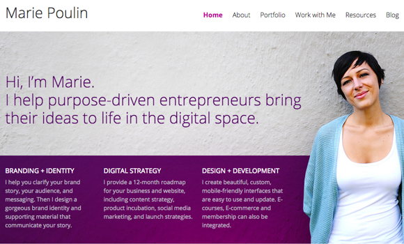
Take a look at the header area from Marie Poulin’s website.

You can see from Marie’s H1 tag that she works with “purpose-driven entrepreneurs”. This automatically excludes a lot of people, but it also speaks directly to those passionate entrepreneurs that she wants to work with. They know they’re in the right place. To further aid the process you can also see a brief overview of how Marie can help.
Don’t be afraid to market yourself specifically to a group of people. If it makes you feel any better, Nusii is aimed at creative professionals but we still have customers from other sectors that equally value our service.
No clear way to contact you.

You probably find it hard to believe but many, many portfolios do their very best to hide their contact details. As a designer you’re constantly trying to solve other people’s business problems and sometimes it’s easy to neglect the most important business of all, your own.
If a potential client can’t immediately see how to get in touch, you may as well just put up a do not disturb sign. They will bail, and rightly so.
Put your contact details in plain sight.
Again if you look to the example above of Marie’s site, you’ll see that “work with me” is in the main navigation area and is always in sight, no matter where you scroll to.
No clear Calls to Action

Every online business has some kind of funnel in place. Whether they’re aware of it is another thing. There are natural funnels where people magically find their way into your inbox, and there are guided funnels where you intentionally take a visitor through a series of steps to end up at a desired destination.
If possible you should avoid leaving your funnel to chance. How? By strategically placing your Calls to Action (CTA’s).
What happens when a visitor gets to the bottom of any given page on your website? Do you give them an incentive to continue elsewhere? Do you ask if they’d like to find out how you work and offer a free guide to working with designers? Do you give them a next step, or do you let them just wander aimlessly? (which of course they can do anyway).
A clear Call to Action can help draw visitors into your funnel. If they’re not ready to commit to any kind of decision today, maybe they’ll be willing to passively learn from you in the very near future.
“Did you like this case study? Perhaps you’d like to read how I helped Company X raise their revenue by 25%”
“Like how I work? Would you like to schedule a quick chat?”
There are so many ways you can help your visitors find their way to your inbox. Don’t leave them hanging at the end of a page.
Lots of pretty pictures and a lack of case studies
![]()
There was a time when people just wanted to see pretty designs (there wasn’t really) so designers filled their portfolios with 101 screen shots of their latest doodles and projects. But design is just a means to an end.
The trouble with this approach is that there’s no context. Potential customers want to know so much more before committing to any kind of action.
- What was your role?
- What problem did you solve, how did you solve it?
- How has the client benefited from working with you?
Without any context your visitors may as well be browsing dribbble.
Which brings me to the next point…
Making it all about mad skills instead of tangible results

Pixel perfect, mind blowing skillz have there place, but they form only one part of the puzzle.
Why do clients hire you, really?
Is it because they think your designs look great? Or is it because they hope you can help move the needle on their business? As the man said, “Design is not just what it looks like and feels like. Design is how it works”. So make sure your visitors know just how you can help their business. Case studies is one way of doing this and another is through…
Business orientated testimonials

How many times have you see a testimonial like the one below?
“Steve was a great guy to work with. His designs skills are fantastic and we can’t wait to work with him again”.”
It’s great right? Everyone knows you’re a great person and you work hard, but this testimonial could do so much more.
How much more effective would it be to wait a little longer after the project finishes and ask for a results orientated testimonial? How much more valuable would the following example be?
“Steve was a great guy to work with. After only 4 weeks we’ve already seen a 15% increase in signups on our landing page. This will mean a significant increase in MRR. We can’t wait to work with him again”.
The difference is obvious, right? If you think it might be more difficult to get these kinds of testimonials there’s a simple solution. Write them yourself and ask for approval. You’re saving the client a job and you get the testimonial angle you need. Of course it all needs to be true. Just make sure you include some kind of data feedback cycle in your proposal’s measures of success.
Cool, yet poor UX

Poor UX is always just around the corner and as mobile patterns slowly creep into desktop design there seem to be more and more corners.
Some designers argue that cool interactions are what clients look for, I’d argue, and without wishing to repeat myself that clients are looking to once more, move the needle on their business.
Obtuse layouts, crazy non-labeled icons, actions that hijack your mouse and a general attitude of, “If they really want it, they’ll find it” account for so many low converting portfolios.
Of course this is great news for designers like you who want to land more clients. You just make it easy for visitors to find what they want, when they want it. Easy!
To increase the number of conversions from more visitor into lead, follow these 6 simple guidelines.
- Define who your customer is (or who you want it to be)
- Make it easy for visitors to contact you
- Make good use of CTA’s to channel visitors through your funnel
- Include well written case studies that show how you have helped improve a previous client’s business
- Swap out those old school testimonials for ones that show how you moved the needle
- Stop it with the cool yet unusable UX patterns. You’re loosing people at the front door.
If you can think of any other great ways to improve conversions on your portfolio, be sure to discuss them below.
Good luck
