

The more I learn about business and design, the less importance I give to aesthetics. Design is a distraction. Don’t hate me yet!
There’s so much more to a successful business than just good design. Design needs a reason to exist, a purpose. By itself design is art, and I’m no artist. I’m not saying you should neglect your design skills, but I would suggest there are more important aspects to our profession. Designer’s need to put business goals before pixels as results will trump a pretty design any, and every day of the week.
This is part 6 of The Ultimate Guide to Proposals. My aim throughout this series is to get you writing better proposals and winning the great majority of them. Today we’ll be looking at reducing clutter so your client can get to the good stuff, the content.
Why Proposal Design Matters Less Than Content
You’ve probably already noticed that design is only a small part of being a designer. To be an effective designer you need to solve the right problems… and you need to know how to communicate the solutions.
Which would you prefer, an app that made your client money, or an app that made it to the front page of dribbble? I know which I’d want. Of course there’s nothing to say you can’t have both. But if you can hit the mark and meet your client’s goals, everything else is a bonus.
What am I trying to say? Well…
The primary goal of any proposal is to win the project! And what is a proposal made of? Content; Headings, sub-headings, paragraphs and sections. Everything outside of that is a distraction.
What Amazon’s Checkout Page Teaches Us About Proposal Design
High converting sales pages, checkout systems and landing pages know this only too well. They exploit it. By removing anything that isn’t 100% relevant to their end goal, they increase their chances of closing the sale. If you’re not sure what I mean, take a look at the example below. You’ll notice that Amazon remove all navigation and external links from the checkout page. You’re left with what’s essential to close the deal. Notice the difference between the two screens…
I’m thinking about buying…
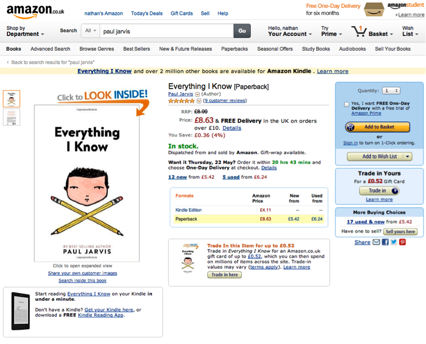
**And now I’ve bought it… **
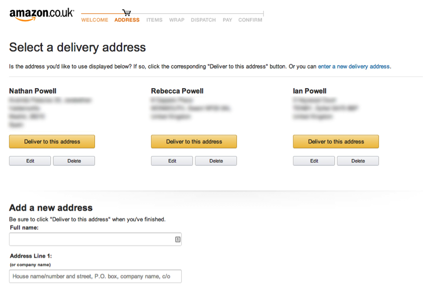
Amazon is helping you focus on the end goal: purchasing their products. In short, remove all distractions. The goal is singular. Get the customer to buy.
You can (and should) apply this principal to your proposals. Content should be presented in such a way that distractions are zero. Using a crazy background image, or funky layout may look cool, but ultimately it will only hinder your success. Make it easy for clients to read their proposal. They want to understand what you’re saying, so make it easy for them. The new wave/old wave message of content first has never been more relevant than for proposals.
Keep it simple, keep it clear and forget about design per se. This is the business of design.
Good luck!
Incase you missed earlier posts in the series:
Part 1 “What’s a proposal”
Part 2 “Why proposals fail”
Part 3 “Client Interviews”